You’ve finally committed to that kitchen remodel you’ve been planning for two years. The contractors are lined up, the cabinets are ordered — and then you hit a wall. Literally. What color do you paint it?
For millions of US homeowners, the “neutral vs. bold” debate is one of the most stressful parts of any renovation. Go too safe with a beige and the room feels flat. Go too daring with a cobalt blue and you’re second-guessing yourself every morning with your coffee. One wrong choice can feel like a renovation color mistake that haunts you for years.
Here’s the thing: there’s no universally right answer — but there is a right answer for you, your home, and your lifestyle. Color psychology in home design tells us that neutrals foster calm and flexibility, while bold hues inject energy, personality, and mood into a space. The trick is knowing which approach serves your goals, whether that’s maximizing resale value, creating a sanctuary, or finally having a home that feels unmistakably yours.
In 2026, interior color trends are leaning into a fascinating tension: earthy warm neutrals on one side, vibrant accents and biophilic greens on the other. Homeowners no longer have to pick a lane — they can play both sides smartly.
This guide breaks down neutral vs. bold palettes to help you pick the perfect home renovation color palette that fits your lifestyle and boosts resale value. Let’s get into it.
Understanding Neutral Color Schemes
Neutrals are the workhorses of interior design — and for good reason. In the color world, neutrals include whites, off-whites, beiges, taupes, warm grays, and greiges (gray-beige hybrids). Think Benjamin Moore’s classic Chantilly Lace, the ever-popular Sherwin-Williams Agreeable Gray, or a warm linen tone that recalls a sun-drenched farmhouse.
What makes neutral color schemes so enduring? Their versatility. They don’t compete with furniture, art, or architectural details — they frame them. And in a real estate market where buyers need to envision themselves in your space, neutrals make that mental leap far easier.
Pros and Cons of Neutral Palettes
Pros:
- Timeless appeal — Neutrals don’t date the way trendy colors do. A soft warm white from 2015 still looks current in 2026.
- Spacious feel — Light neutrals reflect natural light and make rooms feel larger, which matters especially in smaller homes or apartments.
- Easy to stage for selling — Neutral walls are a blank canvas that lets buyers project their own taste.
- Low design risk — Easier to furnish and accessorize without clashing.
- Works in any US region — Whether you’re in a Midwest farmhouse, a coastal California bungalow, or a New England colonial, neutrals translate seamlessly.
Cons:
- Can feel bland without texture — A room full of flat neutrals without varied textures (linen, wood, stone) reads as sterile rather than serene.
- Easy to get wrong — “Neutral” doesn’t mean “safe.” Undertones (green, pink, purple) in grays and whites can clash badly with your flooring or countertops.
- May lack personality — For creative homeowners who want their space to feel curated and bold, all-neutral rooms can feel uninspired.
Color Psychology: Why Neutrals Work
Color psychology in home design shows that bedroom neutral tones — soft whites, warm taupes, and gentle greiges — lower cortisol levels and promote rest. That’s why neutral bedrooms consistently outperform bold ones in sleep quality studies. In home offices, warm neutrals support focus without overstimulating. In open-plan living areas, they unify otherwise disparate zones.
Think of a classic Midwest farmhouse with shiplap walls painted Benjamin Moore White Dove, warm oak floors, and cream linen sofas. Or a coastal California living room in a hazy sage-gray, where the palette blurs the line between indoors and the ocean view outside. These aren’t boring choices — they’re confident ones.
Top 5 Neutral Paint Colors for 2026
| Color Name | Brand | Hex Code | Best Rooms | Undertone |
|---|---|---|---|---|
| Agreeable Gray | Sherwin-Williams | #D1C4B0 | Living rooms, bedrooms | Warm beige |
| Revere Pewter | Benjamin Moore | #C2B9A7 | Family rooms, hallways | Warm gray-green |
| Accessible Beige | Sherwin-Williams | #D4C5A9 | Kitchens, bathrooms | Warm golden |
| Simply White | Benjamin Moore | #F2EEE3 | Any room | Creamy warm |
| Repose Gray | Sherwin-Williams | #C2BEB5 | Bedrooms, offices | Cool gray |
Embracing Bold Color Palettes
Bold colors aren’t for the faint of heart — but they’re absolutely for the committed renovator. In 2026, bold palettes are defined by deep, saturated hues: navy blues, forest and emerald greens, rich terracotta reds, moody plums, and ochre yellows. These are colors that make a statement the moment you walk into a room.
The key to making bold work is color wheel harmony — using complementary, analogous, or split-complementary pairings to keep bold colors from feeling chaotic. A deep teal kitchen island balanced by warm brass hardware and ivory uppers? That’s color wheel harmony in action.
Pros and Cons of Bold Palettes
Pros:
- Undeniable personality — Bold spaces feel curated, intentional, and memorable. They photograph beautifully for social media and design portfolios.
- Mood-boosting — Saturated hues stimulate the brain and create energy. A terracotta dining room makes meals feel festive; an emerald library feels luxuriously intellectual.
- On-trend for 2026 — Interior color trends are embracing biophilic greens and earthy terracottas as part of a broader wellness design movement.
- Higher perceived luxury — When executed well, bold rooms feel expensive and design-forward.
Cons:
- Harder to resell — Polarizing colors can turn off buyers who can’t see past the paint. Bold choices carry more financial risk in the real estate market.
- Overwhelming if misbalanced — Four bold walls without relief feel claustrophobic rather than dramatic.
- Requires stronger commitment — Switching from a navy kitchen to something else means more prep work and primer coats.
Color Psychology: Why Bold Colors Work
Bold accent walls energize social spaces. According to color psychology in home design, red and orange tones stimulate appetite — making warm terracotta a brilliant kitchen remodel color or dining room choice. Emerald and forest greens connect to nature, reducing stress while still feeling sophisticated. Deep blues like Farrow & Ball Hague Blue evoke security and depth, making them ideal for living rooms and libraries where you want to feel cocooned.
Picture a New York City loft with gunmetal gray concrete floors, exposed brick, and a single statement wall in navy — a bold palette that plays to the industrial bones of the space. Or a Southwest-inspired bathroom with terracotta tile, hammered copper fixtures, and walls in a deep adobe red: bathroom renovation hues that feel rooted in the landscape.
Bold Colors to Try in Renovations
| Color Name | Brand | Hex Code | Best Used | Pair With |
|---|---|---|---|---|
| Hague Blue | Farrow & Ball | #2A3D4A | Living rooms, libraries | Brass, ivory |
| Chili Pepper | Behr | #7A1C1C | Dining rooms, accent walls | Warm wood, cream |
| Jasper Green | Benjamin Moore | #3B5C3E | Kitchens, bathrooms | Marble, white |
| Deep Burgundy | Sherwin-Williams | #6B2232 | Bedrooms, powder rooms | Gold, blush |
| Canyon Clay | Behr | #B05A35 | Entryways, kitchens | Cream, sage green |
Neutral vs. Bold: Key Comparisons
So which approach is right for your renovation? The honest answer depends on five key factors.
5 Factors for Choosing Your Palette
- Natural light — Dark or north-facing rooms rarely flatter deep bolds; they need light to activate. If your kitchen faces north, lean neutral or use bold as an accent only.
- Home style — A Colonial farmhouse calls for warm neutrals; a mid-century modern home can handle bold teals and mustards with aplomb.
- Resale impact — If you’re selling within five years, neutrals protect your investment. If you’re staying for decades, go bold and live your best life.
- Maintenance — Bold colors, particularly on high-traffic surfaces, show scuffs and scratches more visibly. Factor in repainting costs.
- Budget — Bold accent walls are a cost-effective way to inject drama without committing to full-room repaints. A single bold wall costs a fraction of four.
Room-by-Room Breakdown
Lifestyle matters too. Families with young children often favor forgiving warm neutrals that hide fingerprints and look clean between deep cleans. Creatives, entertainers, and design enthusiasts gravitate toward bold palettes that make spaces feel alive.
- Kitchen remodel colors: Warm neutrals (soft whites, greiges) remain the safest choice for resale, stimulating a clean, appetite-friendly environment. For drama, go bold on an island or lower cabinets only.
- Living room color palettes: This is where bold shines. A single accent wall in a deep, saturated color anchors a social space and gives furniture something to play against.
- Bathrooms: Spa-like neutrals work beautifully in master baths. But powder rooms — tiny, low-commitment spaces — are the perfect place to go full bold. Nobody spends enough time in one to feel overwhelmed.
- Bedrooms: Bedroom neutral tones win here. Soft greiges, warm whites, and dusty blue-grays promote sleep and feel universally restful.
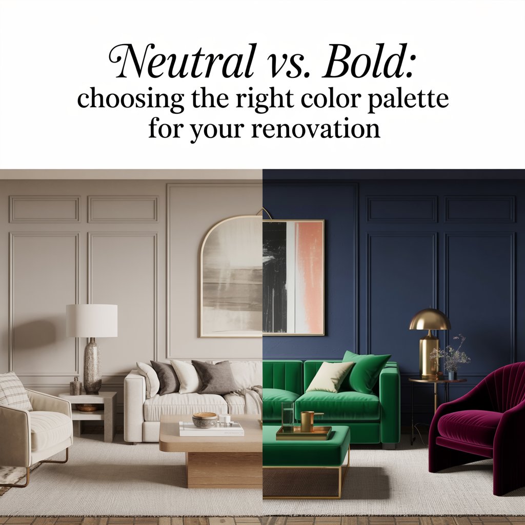
Imagine a before/after split: On the left, a living room in flat builder-beige — forgettable, lifeless. On the right, the same room with three walls in warm greige and one accent wall in deep forest green, anchored by a cognac leather sofa and brass floor lamp. The bold accent transforms the space; the neutral base keeps it grounded. That’s the power of a hybrid approach.
Practical Tips for Your Paint Color Selection Guide
Here’s where we get tactical. Follow these steps to make a confident, informed color decision before a single brush hits your walls.
Step-by-Step Process
- Test samples in real light. Never choose a paint color from a chip in the store. Buy sample pots (most brands offer 8 oz. for under $5) and paint 12-inch swatches on multiple walls. Live with them for 48–72 hours, observing in morning light, afternoon sun, and artificial evening light. Colors shift dramatically across lighting conditions.
- Use digital visualization apps. Sherwin-Williams ColorSnap, Benjamin Moore Color Portfolio, and Behr’s ColorSmart app let you upload a photo of your actual room and preview colors digitally. It’s not perfect, but it eliminates obvious mismatches before you commit.
- Apply the 80/20 rule. For most rooms, use an 80% neutral base (walls, large furniture) and reserve 20% for bold accents (one wall, throw pillows, art, cabinetry). This ratio delivers personality without overwhelm and is the sweet spot between warm neutrals vs. vibrant accents.
- Avoid the most common renovation color mistakes:
- Ignoring undertones. That gray you loved in the store? It may read lavender or green on your walls next to your warm wood floors. Always check undertones against your existing finishes.
- Skipping primer. Going bold over white — or neutral over bold — requires quality primer. Skipping it costs more in the long run.
- Matching instead of coordinating. Your walls shouldn’t match your sofa exactly. Coordinate across a tonal range instead.
- Forgetting the ceiling. A slightly warmer or slightly darker version of your wall color on the ceiling adds depth. Bright white ceilings above warm-toned walls often clash.
- Go shopping in person. Fan decks from Home Depot and Lowe’s let you compare hundreds of shades side by side. Pull out a fan deck next to your flooring sample, countertop swatch, or cabinet door before finalizing any decision.
2026 Color Trends to Know
- Sustainable and low-VOC paints are mainstream now, with brands like ECOS, Clare, and Benjamin Moore’s Natura line dominating the eco-conscious segment.
- Biophilic bold greens — forest greens, moss tones, and deep sage — are the breakout color story of 2026, bridging the gap between bold personality and nature-connected calm.
- Warm terracotta and clay continue their upward trend, particularly in kitchens, entryways, and bathrooms influenced by Southwest and Mediterranean aesthetics.
- Quiet Luxury neutrals — complex, sophisticated greiges and soft warm whites — are replacing the cool gray dominance of the 2010s.
Real US Renovation Case Studies
The Texas Family: Neutral Done Right
A couple in Austin, Texas, updated their open-plan kitchen and living room from builder-beige to a warm palette anchored by Sherwin-Williams Accessible Beige on the walls, white shaker cabinets, and warm oak LVP flooring. They resisted the temptation to go bold and instead layered texture through woven blinds, terracotta planters, and a patterned area rug. Their real estate agent estimated the polished neutral renovation added approximately $20,000 to their home’s perceived value when they listed two years later — and it sold in four days.
The NYC Renter: Bold Accent Wall on a Budget
A graphic designer in Brooklyn, renting a 650-square-foot apartment, negotiated permission to paint one living room wall in Farrow & Ball Hague Blue. Total cost: under $80. The result was a dramatic, design-forward focal point that made her small apartment feel curated and intentional. She documented the transformation on Instagram, where it gained thousands of saves. When she moved out, two coats of primer and one coat of the landlord’s builder white restored the wall completely.
The Midwest Farmhouse Refresh
A family in Columbus, Ohio, renovated their 1920s farmhouse bathroom with a bold combination of deep navy shiplap, white subway tile, and matte black fixtures. The bathroom renovation hues felt period-appropriate and dramatic — a departure from their all-neutral main floor — and created a spa-like retreat that became the home’s most-talked-about feature at every dinner party.
Conclusion
The neutral vs. bold debate doesn’t have a wrong answer — it has your answer. Neutrals offer timelessness, flexibility, and proven resale value. Bold colors deliver personality, energy, and the kind of design confidence that makes a home feel truly lived-in and loved.
The smartest renovators in 2026 aren’t choosing one or the other — they’re choosing both, strategically. A warm neutral base with bold accents gives you the best of both worlds: a home that’s easy to sell and exciting to live in.
So whether you’re drawn to the serene quiet of Agreeable Gray or the dramatic depth of Hague Blue, the most important step is to start testing. Get those sample pots. Try the apps. Trust your gut — and your lighting.
Test your home renovation color palette today — and share your picks in the comments below! Still not sure where to start? Download our free Neutral vs. Bold Color Palette Cheat Sheet, or take our two-minute color quiz to find your perfect renovation starting point.
Frequently Asked Questions
Are neutral color schemes outdated in 2026? Not at all. In fact, 2026’s trend toward “Quiet Luxury” design has revitalized sophisticated neutrals. The shift is away from cool grays toward warmer, more complex tones — think greige, warm linen, and creamy whites with character.
How do I choose between warm neutrals vs. vibrant accents? Start with your lifestyle and timeline. If you’re selling within five years, lean neutral. If you’re staying put and want a space that reflects your personality, incorporate bold accents strategically — one wall, cabinetry, or a major furniture piece.
What are the best kitchen remodel colors for resale? Warm whites, soft greiges, and light sage greens consistently perform best in resale. Avoid very dark or very saturated colors on all kitchen surfaces if resale is a priority.
Can I mix neutral and bold in the same room? Absolutely — and you should. The 80/20 rule (80% neutral base, 20% bold accents) is the most reliable formula for a balanced, design-forward space that doesn’t overwhelm.
What renovation color mistakes should I avoid? The biggest ones: choosing paint under store fluorescents without testing at home, ignoring undertones in “neutral” grays, skipping primer when making dramatic color changes, and painting all four walls bold in a small room without visual relief.